Nomos Sans. The taste of order in a brutalist sans. By Identity Letters
People have identities. So do typefaces. Fonts matter because identity matters.

Nomos Sans

The Nomos superfamily is our take on the “brutalist” genre. Its raw aesthetics reveal an orderly construction rooted both in classic modernism and the internet age—with simple, functional letterforms and the blunt convergence of diagonal and vertical stems. Nomos Sans is a low-contrast neogrotesk with 18 styles and a set of 1000+ characters.

Nomos Sans – The complete family

These are all the styles contained in the Nomos Sans font family. You can purchase single fonts or family packages.

Nomos Sans Complete (19 Fonts)

From €199.00 excl. VAT
Variable Thin Thin Italic ExtraLight ExtraLight Italic Light Light Italic Regular Regular Italic Medium Medium Italic SemiBold SemiBold Italic Bold Bold Italic ExtraBold ExtraBold Italic Black Black Italic

Nomos Sans – Styles

Write your own words — like a book or movie title, business name, brand claim, advertising slogan, or a short text — to see how they look typeset in Nomos Sans.

Nomos Sans Black
€40.00
Size
When I was young I thought that money was the most important thing in life. Now that I am old, I know that it is.
Nomos Sans Black Italic
€40.00
Size
When I was young I thought that money was the most important thing in life. Now that I am old, I know that it is.
Nomos Sans ExtraBold
€40.00
Size
When I was young I thought that money was the most important thing in life. Now that I am old, I know that it is.
Nomos Sans ExtraBold Italic
€40.00
Size
When I was young I thought that money was the most important thing in life. Now that I am old, I know that it is.
Nomos Sans Bold
€40.00
Size
When I was young I thought that money was the most important thing in life. Now that I am old, I know that it is.
Nomos Sans Bold Italic
€40.00
Size
When I was young I thought that money was the most important thing in life. Now that I am old, I know that it is.
Nomos Sans SemiBold
€40.00
Size
When I was young I thought that money was the most important thing in life. Now that I am old, I know that it is.
Nomos Sans SemiBold Italic
€40.00
Size
When I was young I thought that money was the most important thing in life. Now that I am old, I know that it is.
Nomos Sans Medium
€40.00
Size
When I was young I thought that money was the most important thing in life. Now that I am old, I know that it is.
Nomos Sans Medium Italic
€40.00
Size
When I was young I thought that money was the most important thing in life. Now that I am old, I know that it is.
Nomos Sans Regular
€40.00
Size
When I was young I thought that money was the most important thing in life. Now that I am old, I know that it is.
Nomos Sans Regular Italic
€40.00
Size
When I was young I thought that money was the most important thing in life. Now that I am old, I know that it is.
Nomos Sans Light
€40.00
Size
When I was young I thought that money was the most important thing in life. Now that I am old, I know that it is.
Nomos Sans Light Italic
€40.00
Size
When I was young I thought that money was the most important thing in life. Now that I am old, I know that it is.
Nomos Sans ExtraLight
€40.00
Size
When I was young I thought that money was the most important thing in life. Now that I am old, I know that it is.
Nomos Sans ExtraLight Italic
€40.00
Size
When I was young I thought that money was the most important thing in life. Now that I am old, I know that it is.
Nomos Sans Thin
€40.00
Size
When I was young I thought that money was the most important thing in life. Now that I am old, I know that it is.
Nomos Sans Thin Italic
€40.00
Size
When I was young I thought that money was the most important thing in life. Now that I am old, I know that it is.

Nomos Sans – Character Set

These are all the characters contained in the Nomos Sans glyph set. It’s a great way for you to check the language support, stylistic alternates, OpenType features, and special characters like dingbats and icons. Click a character to see more details.

Character map
Font styleUnicode decimal32Unicode hex0020HTML entity 
Basic Latin
!
"
#
$
%
&
'
(
)
*
+
,
-
.
/
0
1
2
3
4
5
6
7
8
9
:
;
<
=
>
?
@
A
B
C
D
E
F
G
H
I
J
K
L
M
N
O
P
Q
R
S
T
U
V
W
X
Y
Z
[
\
]
^
_
`
a
b
c
d
e
f
g
h
i
j
k
l
m
n
o
p
q
r
s
t
u
v
w
x
y
z
{
|
}
~
Latin-1 Supplement
 
¡
¢
£
¤
¥
¦
§
¨
©
ª
«
¬
­
®
¯
°
±
²
³
´
·
¸
¹
º
»
¼
½
¾
¿
À
Á
Â
Ã
Ä
Å
Æ
Ç
È
É
Ê
Ë
Ì
Í
Î
Ï
Ð
Ñ
Ò
Ó
Ô
Õ
Ö
×
Ø
Ù
Ú
Û
Ü
Ý
Þ
ß
à
á
â
ã
ä
å
æ
ç
è
é
ê
ë
ì
í
î
ï
ð
ñ
ò
ó
ô
õ
ö
÷
ø
ù
ú
û
ü
ý
þ
ÿ
Latin Extended-A
Ā
ā
Ă
ă
Ą
ą
Ć
ć
Ĉ
ĉ
Ċ
ċ
Č
č
Ď
ď
Đ
đ
Ē
ē
Ĕ
ĕ
Ė
ė
Ę
ę
Ě
ě
Ĝ
ĝ
Ğ
ğ
Ġ
ġ
Ģ
ģ
Ĥ
ĥ
Ħ
ħ
Ĩ
ĩ
Ī
ī
Ĭ
ĭ
Į
į
İ
ı
IJ
ij
Ĵ
ĵ
Ķ
ķ
ĸ
Ĺ
ĺ
Ļ
ļ
Ľ
ľ
Ŀ
ŀ
Ł
ł
Ń
ń
Ņ
ņ
Ň
ň
ʼn
Ŋ
ŋ
Ō
ō
Ŏ
ŏ
Ő
ő
Œ
œ
Ŕ
ŕ
Ŗ
ŗ
Ř
ř
Ś
ś
Ŝ
ŝ
Ş
ş
Š
š
Ţ
ţ
Ť
ť
Ŧ
ŧ
Ũ
ũ
Ū
ū
Ŭ
ŭ
Ů
ů
Ű
ű
Ų
ų
Ŵ
ŵ
Ŷ
ŷ
Ÿ
Ź
ź
Ż
ż
Ž
ž
Latin Extended-B
Ə
ƒ
Ɲ
Ǧ
ǧ
Ǫ
ǫ
Ǻ
ǻ
Ǽ
ǽ
Ǿ
ǿ
Ș
ș
Ț
ț
Ȳ
ȳ
ȷ
IPA Extensions
ə
ɲ
Spacing Modifier Letters
ˆ
ˇ
˘
˙
˚
˛
˜
˝
Combining Diacritical Marks
̀
́
̂
̃
̄
̆
̇
̈
̊
̋
̌
̒
̣
̦
̧
̨
Latin Extended Additional
General Punctuation
Superscripts and Subscripts
Currency Symbols
Letterlike Symbols
Number Forms
Arrows
Mathematical Operators
Geometric Shapes
Dingbats
Alphabetic Presentation Forms
Enclosed Alphanumeric Supplement
🄋
🄌
OpenType features
OFF
A
ON
A
Font styleUnicode decimal65Unicode hex0041OpenType featurec2scHTML entities&#x41;
Small Capitals From Capitals
A
Á
Ă
Â
Ä
À
Ā
Ą
Å
Ǻ
Ã
Æ
Ǽ
B
C
Ć
Č
Ç
Ĉ
Ċ
D
Ď
Đ
Ð
E
É
Ĕ
Ě
Ê
Ë
Ė
È
Ē
Ę
Ə
F
G
Ğ
Ǧ
Ĝ
Ģ
Ġ
H
Ħ
Ĥ
I
IJ
Í
Ĭ
Î
Ï
İ
Ì
Ī
Į
Ĩ
J
Ĵ
K
Ķ
L
Ĺ
Ľ
Ļ
Ŀ
Ł
M
N
Ń
Ň
Ņ
Ɲ
Ñ
Ŋ
O
Ó
Ŏ
Ô
Ö
Ò
Ő
Ō
Ǫ
Ø
Ǿ
Õ
Œ
P
Þ
Q
R
Ŕ
Ř
Ŗ
S
Ś
Š
Ş
Ŝ
Ș
T
Ŧ
Ť
Ţ
Ț
U
Ú
Ŭ
Û
Ü
Ù
Ű
Ū
Ų
Ů
Ũ
V
W
Ŵ
X
Y
Ý
Ŷ
Ÿ
Ȳ
Z
Ź
Ž
Ż
0
1
2
3
4
5
6
7
8
9
¢
¤
$
£
¥
+
×
÷
=
>
<
±
~
¬
Case-Sensitive Forms
0
1
2
3
4
5
6
7
8
9
¡
¿
/
\
-
(
)
{
}
[
]
«
»
ƒ
|
¦
¢
¤
$
£
¥
+
×
÷
=
>
<
±
~
¬
Glyph Composition / Decomposition
̊́
Discretionary Ligatures
ffb
ffh
ffj
ffk
fft
fb
fh
fj
fk
fl
ft
tt
Denominators
0
1
2
3
4
5
6
7
8
9
Fractions
/
0
1
2
3
4
5
6
7
8
9
Standard Ligatures
ffi
ffl
ff
fi
fl
Lining Figures
0
1
2
3
4
5
6
7
8
9
ƒ
¢
¤
$
£
¥
Numerators
0
1
2
3
4
5
6
7
8
9
Oldstyle Figures
0
1
2
3
4
5
6
7
8
9
ƒ
¢
¤
$
£
¥
+
×
÷
=
>
<
±
~
¬
Ordinals
No.
Proportional Figures
0
1
2
3
4
5
6
7
8
9
ƒ
¢
¤
$
£
¥
+
×
÷
=
>
<
±
~
¬
Scientific Inferiors
0
1
2
3
4
5
6
7
8
9
Small Capitals
a
á
ă
â
ä
à
ā
ą
å
ǻ
ã
æ
ǽ
b
c
ć
č
ç
ĉ
ċ
d
ď
đ
ð
e
é
ĕ
ě
ê
ë
ė
è
ē
ę
ə
f
g
ğ
ǧ
ĝ
ģ
ġ
h
ħ
ĥ
i
ı
í
ĭ
î
ï
ì
ī
į
ĩ
ij
j
ȷ
ĵ
k
ķ
l
ĺ
ľ
ļ
ŀ
ł
m
n
ń
ň
ņ
ɲ
ñ
ŋ
o
ó
ŏ
ô
ö
ò
ő
ō
ǫ
ø
ǿ
õ
œ
p
þ
q
r
ŕ
ř
ŗ
s
ś
š
ş
ŝ
ș
ß
t
ŧ
ť
ţ
ț
u
ú
ŭ
û
ü
ù
ű
ū
ų
ů
ũ
v
w
ŵ
x
y
ý
ŷ
ÿ
ȳ
z
ź
ž
ż
0
1
2
3
4
5
6
7
8
9
¢
¤
$
£
¥
+
×
÷
=
>
<
±
~
¬
single story a
a
á
ă
â
ä
à
ā
ą
å
ǻ
ã
double story a without hook
a
á
ă
â
ä
à
ā
ą
å
ǻ
ã
triple story g
g
ğ
ǧ
ĝ
ģ
ġ
l with hook
l
ĺ
ľ
ļ
ŀ
ł
u with sporn
u
ú
ŭ
û
ü
ù
ű
ū
ų
ů
ũ
y with u form
y
ý
ŷ
ÿ
ȳ
I without Serifs
y
ý
ŷ
ÿ
ȳ
I without a Serif
I
Í
Ĭ
Î
Ï
İ
Ì
Ī
Į
Ĩ
J without a Serif
J
Ĵ
Tradtional Y
Y
Ý
Ŷ
Ÿ
Ȳ
Square dots and Punctuation
Ä
Ċ
Ë
Ė
Ġ
Ï
İ
Ŀ
Ö
Ü
Ÿ
Ż
ä
ċ
ë
ė
ġ
i
ï
ij
j
ŀ
ö
ü
ÿ
ż
.
:
;
!
¡
?
¿
·
Subscript
0
1
2
3
4
5
6
7
8
9
Superscript
0
1
2
3
4
5
6
7
8
9
Tabular Figures
0
1
2
3
4
5
6
7
8
9
ƒ
¢
¤
$
£
¥
Slashed Zero
0

Nomos Sans – Design Information

What is a brutalist typeface? The exact definition is anyone’s guess. Nonetheless, the Nomos superfamily is our take on the genre.

Like the eponymous architectural style of the second half of the 20th century, Nomos is raw, direct, and honest. Its unrefined aesthetics reveal an orderly construction that is just as firmly rooted in classic modernism as in the internet age.

This is most evident in the simple, functional letterforms and the blunt convergence of diagonal and vertical stems. After all, the brutalist spirit doesn’t see the need to hide the elements it consists of. Instead, it celebrates each material and each connection as it is, radiating the taste of order.

The Nomos Sans subfamily takes the form of a low-contrast neogrotesk and is equipped with 18 styles and a set of 1000+ characters. In spite of its straightforward appearance, Nomos Sans grants you an impressive suite of advanced OpenType features. These include numerous figure sets (tabular, proportional, lining, and oldstyle figures, numerator, denominator, etc.), small capitals, and more than 10 stylistic sets.

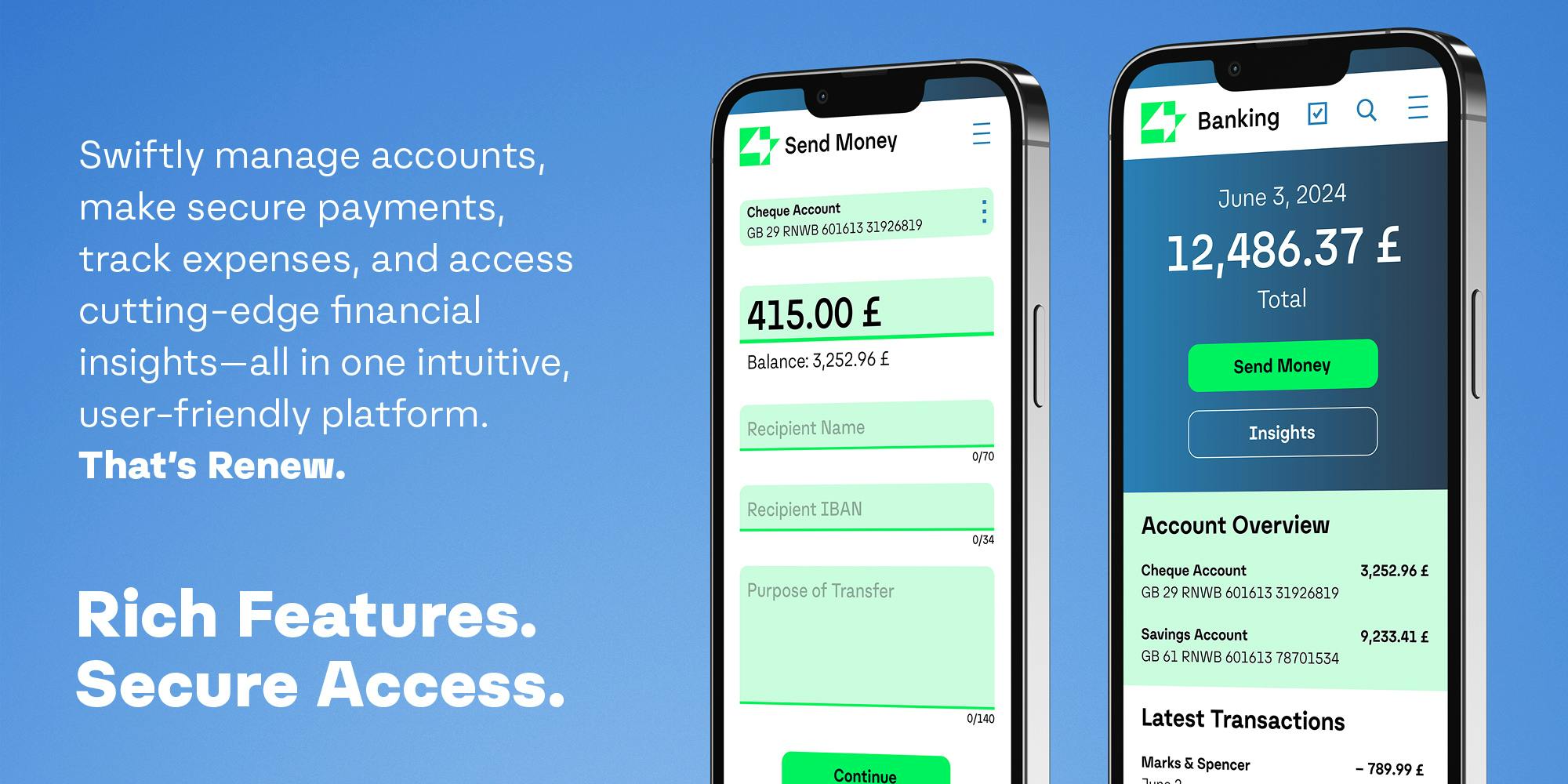
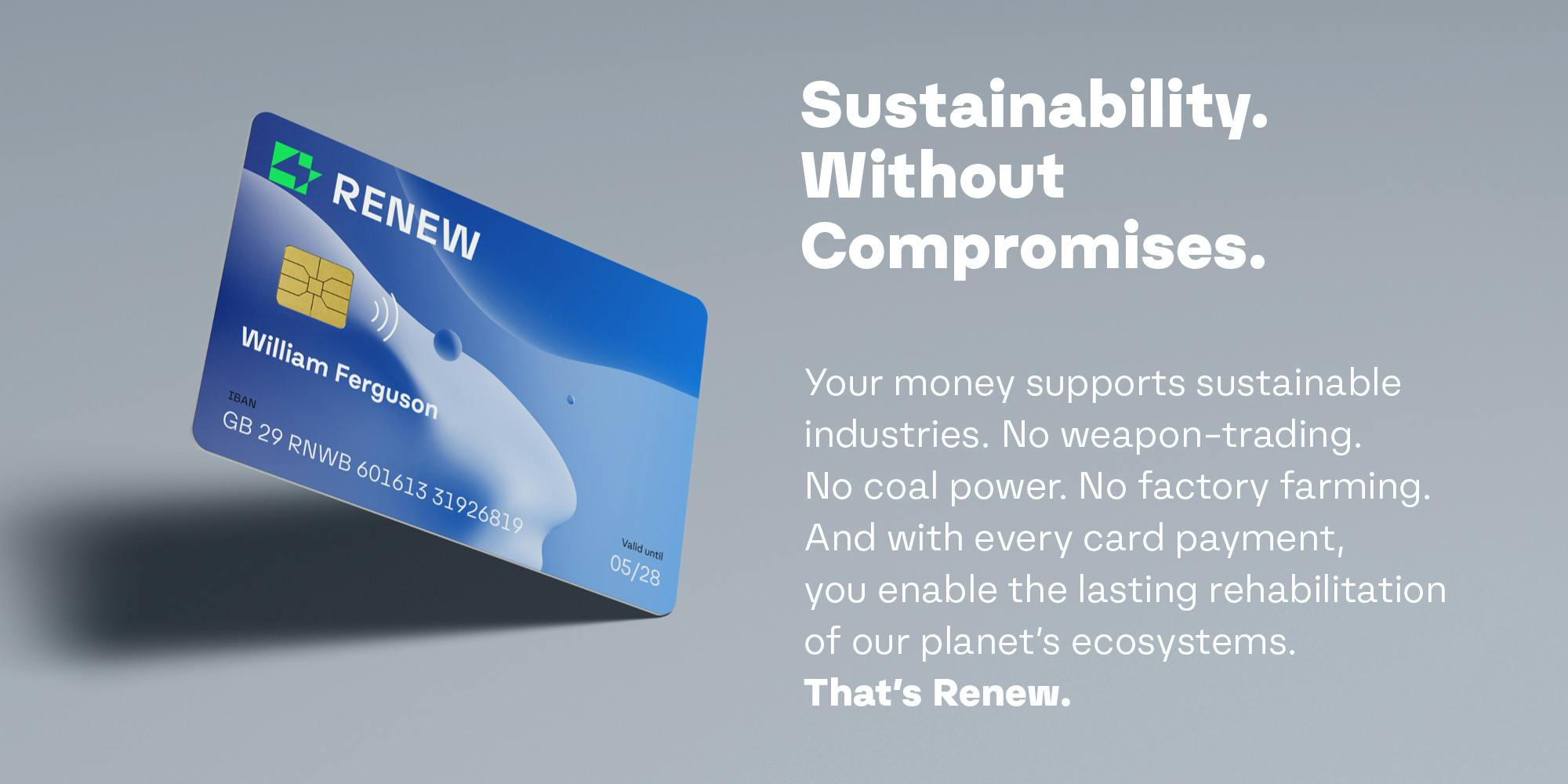
Nomos Sans is on its home turf in a wide range of technology and finance-related industries, making it a great font choice for engineering and construction firms, banking and blockchain startups, tool and equipment manufacturers, as well as cargo and transport companies. However, Nomos Sans is pretty versatile, especially when infused with the effects of its stylistic sets. It will work brilliantly in countless use cases, from advertising to publishing to art & culture. True to its name, Nomos Sans will even perform in law-related branding, whether for an individual lawyer, a law firm, or an insurance company.

With that in mind, Nomos humbly takes a back seat in body copy and shows its raw vigor in large sizes as its unique features don’t come at the expense of legibility. It’s a font family you can use confidently for small sizes; yet it still lets you set a crisp poster-size headline.

This kind of versatility makes Nomos a top-tier tool for print and web alike. It’s apt for books, magazines, editorial design, brochures, leaflets, posters and billboards while also looking great in UI/UX design, on websites, blogs, social media graphics and interfaces, and all kinds of apps. For extra versatility and optimal results, pair it with Nomos Slab.

If true neutral has too little character for your project, opt for a lawful good alternative. That alternative is Nomos.


Credits
Spacing / Kerning: Sebastian Carewe
Graphics & Editing: Johannes López Ayala

Download Test Fonts